HANSI ZHU
WORK
PLAY
ABOUT
CONTACT
Overview Problem Research Design Takeaways

Open Carbon Protocol

Overview

My co-designer and I collaborated with the Chief Product Officer and the Head of Product Design at oneshot.earth to redesign the Open Carbon Protocol’s public registry.

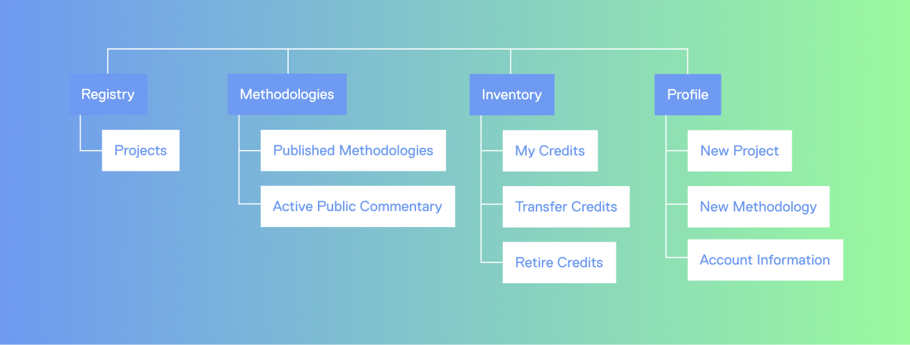
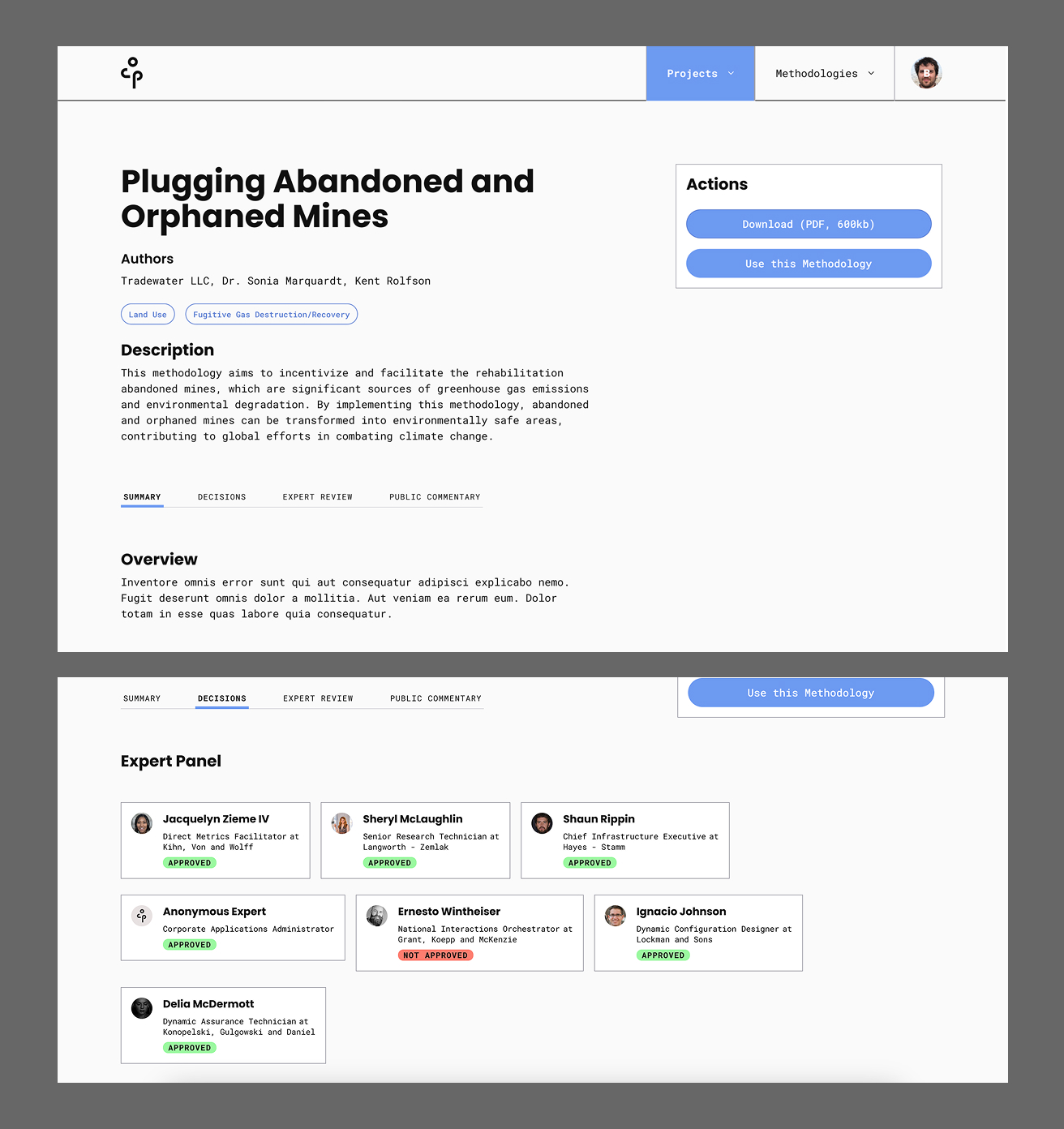
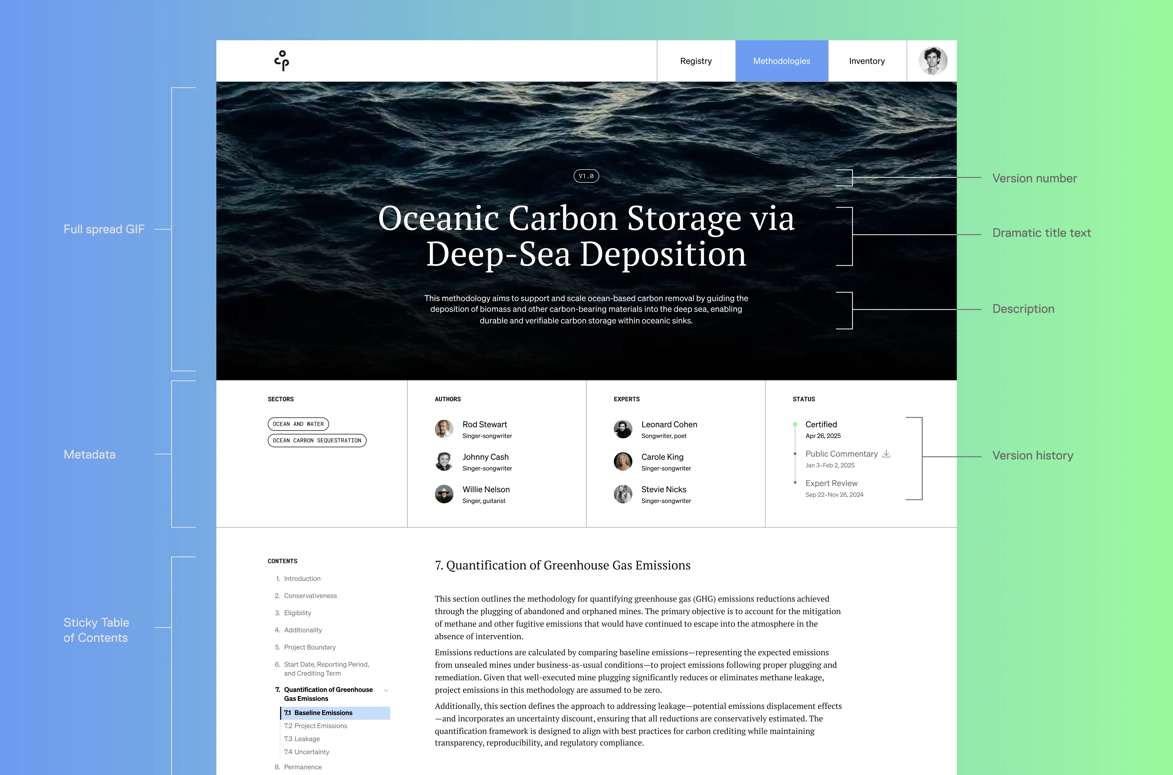
This case study details my work on the information architecture, navigation system, and interface design to clarify their complex climate-related processes for a wider audience.

Role

  • Product Designer
  • Project Manager

Client

oneshot.earth

Team

  • Hansi Zhu (me!)
  • Jenna Shon, Designer

Timeline

Spring 2025 (5 weeks)

Problem

Context

The Open Carbon Protocol

The Open Carbon Protocol needed a public registry that matched its values: transparent, collaborative, and easy to use. But the platform's navigation was confusing, the content overwhelming, and the experience alienating to non-experts. Our task was to redesign the platform so anyone—even a layperson—could find their way in.

The Challenge

How can we make the carbon crediting system accessible and engaging to newcomers and professionals alike?

☺ Research

Background

Why carbon crediting?

Product Strategy

Transparency, trustworthiness, collaboration, and speed

Throughout our discussions, the leaders at oneshot.earth emphasized their desire to rebuild trust in the carbon crediting market by promoting the above company values. With this in mind, and after poking around on their existing site, I developed my four overarching goals.

Design Goals

☺ Design

Information Architecture

Categorizing by stage and function

Originally, the IA was inconsistent, with some items misaligned in hierarchy and relevance. Various stages in the process were grouped together without clear differentiation between the functions of the pages themselves. It looked like this:

We reorganized and condensed the structure, assigning categories by their stages and functions to create a more logical flow:

Navigation Menu

From here, I created a more assistive and intuitive menu

What I was given:

...and what I made:

Methodology Pages

Editorial-style immersion for familiarity and engagement

I brought editorial-style glam to the UI of each methodology page to transform the complex and text-heavy document into an inviting and educational experience.

Those pages went from looking like this, where the user had to open individual tabs to access metadata...

to this:

I kept the original lined grid motif...

...while taking care to ensure that the methodology's metadata was highlighted upfront...

...as well as interactively linked to the broader site ecosystem for discoverability and navigation.

Because methodologies serve as rulebooks for projects hoping to measure their climate impact, these pages are central reference points that deserve an experience worth returning to and the extra time it takes to customize them.

Typographic System

Fresh and academic

The team was keen to incorporate a serif font to evoke the credibility of scholarly articles and scientific papers. We paired one with a sleek, adaptive sans-serif to keep it fresh and relevant. We kept the original monospace for metadata to tie the two together.

☺ Takeaways

Thanks for reading!